This subtab shows a table of the DME data usage of each user in the DME system. You can sort the table by clicking the table headers. Within the time frame shown just below the subtab header, the statistics show the following (by column):
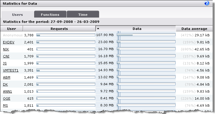
The name of the user for whom the DME data statistics are logged. Click to see more details about the user. The first user is always called Anonymous - this "user" is not a real user, but covers various overhead and data traffic that cannot be allocated to any particular user, such as failed logins and application downloads.
The totals line shows the total number of users in the system (irrespective of the number of lines you have currently chosen to show in the table navigation bar).
This column shows the number of requests for DME data made by a user's device within the stated time frame. A request could be one act of synchronization, or an application download (client upgrade). Next to the actual number of requests is a graph showing the user's share of the overall number of requests made to the server. If you let the mouse pointer rest on the colored part of the graph, a tooltip text will reveal the user's share of the total requests made as a percentage.
The totals line shows the total number of requests made to the server. Note that the numbers in the lines above may not add up to the total shown here - the total is the system total, whereas the table only shows the number of lines specified in the table navigation bar.
This column shows the amount of DME data transferred by each user. After the actual number, a graph shows the user's share in the overall DME data traffic within the specified time frame. The graph is filled with two shades of blue: A dark blue (the left-hand end) showing the percentage of Incoming data (for instance calendar entries created on the device and synchronized to the server), and a lighter blue showing the percentage of Outgoing data (synchronized or downloaded to the device). If you let the mouse pointer rest on either color, a tooltip text will reveal the actual percentage.
The hatched area (![]() ) at the beginning of the graphs shows the standard deviation and the mean (the solid blue line) of the total set of data.
) at the beginning of the graphs shows the standard deviation and the mean (the solid blue line) of the total set of data.
The totals line shows the total amount of data moved. Note that the numbers in the lines above may not add up to the total shown here - the total is the system total, whereas the table only shows the number of lines specified in the table navigation bar.
This column shows the average amount of DME data transferred by each user - that is, the average amount of data per request. The percentage number in parentheses indicates the user's average request size in relation to the total average shown in the totals line. This way you can for instance quickly identify users that transfer a large amount of data per request.
The first number in the totals line shows the total amount of data (the Data column) divided by the total number of users (the User column), resulting in the average amount of data moved per user. The second number shows the total number of requests (the Requests column) divided by the total amount of data, resulting in the average request size.