![]() In the Monitor section of the Server configuration panel, you can view the properties of the DME server and the different services that the DME server depends on. Furthermore, you can see statistics and trends about server and connector performance.
In the Monitor section of the Server configuration panel, you can view the properties of the DME server and the different services that the DME server depends on. Furthermore, you can see statistics and trends about server and connector performance.
This information is useful for troubleshooting the server and connectors.
The Monitor section is divided into the following two tabs.
[ Expand All | Collapse All ]
The Server properties tab shows some statistics and environment information about the DME server.
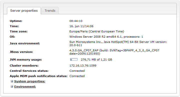
The following information is shown:
The DME server has been running for this amount of time. The time is shown as a number of days plus a number of hours, minutes, and seconds.
This is the current server time.
This is the current server time zone.
The full name of the operating system on which DME is installed.
The Java version installed on the server.
The version of the Java application server JBoss from Red Hat. Note that as of DME 3.5, DME uses the Enterprise Edition of JBoss - in previous versions, we used the Community Edition.
This is the memory usage of the Java Virtual Machine.
For instance, if the numbers are 1.15 GB of 1.22 GB, it means the following: 1.22 GB is the maximum amount of memory available for Java objects in the JVM. The JVM itself takes up memory, but that is not included in this amount. Out of the 1.22 GB, 1.15 GB is actually being used by JBoss and DME. Please note that for performance reasons, the JVM will not release memory (from no-longer-used Java objects etc.) until it is necessary, and therefore the usage will often seem to be higher than it actually is.
This field lists the IP addresses of the online, active members of the DME cluster. The server listed first is the primary server in the cluster (the master node). If the master node is down, number two in the list will take over and become the master node. This does not change, even when the original master node is back online.
If DME is not set up with multiple servers, only the current server is listed in this field.
If the DME server has been configured to connect with DME Central Services, this fields shows if the connection was successful (Connected). Among other things, this has an impact on Apple Push Notification Services. For more information, see Setting up notifications on Apple iOS and Central Services.
If an Apple MDM APNS certificate has been installed on the server, this fields shows Connected. It is then possible to enroll and configure iOS devices. For more information, see MDM on Apple iOS.
Click to expand this field. The field shows information about the Java system installed on the server, as reported by Java.
Click to expand this field. The field shows information about the server environment as reported by Java.
The Trends tab shows a collection of statistic trends and key performance indicators concerning the DME server and connectors.
The list of statistics contains four columns:
This is the name of the statistic. Click the name to view the statistic (as explained below).
The DME component to which the current statistic pertains. This could be the DME server, which is shown with a server icon and the name of the server, or a connector, which is shown with a connector icon and the name of the connector.
An arrow in this column shows if the trend has been rising or falling over the last 4 hours. The trend analysis is based on a linear regression analysis of the measurements. If the result of the regression analysis is at least 5% above the measured average, the trend is rising, and a grey upward arrow is displayed. If the result is at least 5% below the measured average, the trend is falling, and a grey downward arrow is shown. If no significant change has occurred, no arrow is shown.
This column shows the average over the last 4 hours. An ![]() icon in this column means that the average cannot be calculated due to lack of data.
icon in this column means that the average cannot be calculated due to lack of data.
When you click the name of a statistic, an interactive graph is shown below the name. All statistics are created using the RRD4J tool, which makes use of round-robin databases for dynamic collection and display of data. For a technical explanation of the principles behind the collection and display of data, please see the following tutorial: RRD4J Tutorial.
Each trend graph contains three trend blocks: Days, Hours, and Minutes. You can switch between them by clicking the D, H, or M button at the bottom left of the graph. Each trend block contains four windows showing data for a span of time. The Days trend block contains a total time span of 2 years, split into 4 windows of 6 months each. The Hours trend block contains a total time span of 4 weeks, split into 4 windows of 1 week each. The Minutes trend block, which is the default view, contains a total time span of 8 hours, split into 4 windows of 2 hours each.
Clicking the grey, vertical bars to the left and right of the graph moves the window back or forward, respectively. You can also click one of the grey dots at the top left of the graph to select one of the four windows. Note that when you move between windows, the Y axis scale may change. When the latest window is displayed (dot no. four is selected), the graph will be updated automatically. There is no need to press Refresh to update the graph. In fact, if you refresh the browser page, all open graphs will close. Below the graph are the statistics for the window shown in the graph.
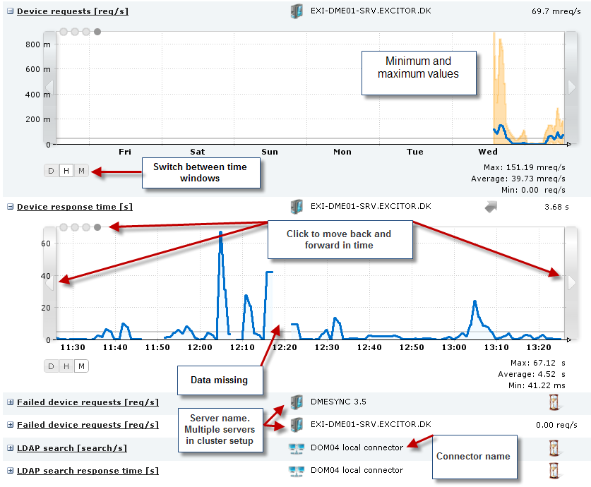
DME collects data every minute (this is called the sample time). This is important when you want to understand the numbers. For instance, the graph may show that 4.3 database connections were open at a given point - such a number only makes sense when you remember that the number of connections was measured once every minute, and an average calculated. The graph is drawn using linear interpolation - a straight line is drawn between each measuring point (minute) to create the graph (instead of drawing only vertical and horizontal lines, for instance, or only drawing lines between every other measuring point).
The calculated average for the current view is shown as a thin, grey line across the graph. If more than 50% of the data in the view is invalid (typically if there are no data for a period of time), no average is calculated. This accounts for any "holes" in the graph.
Below the graph are the Max, Average, and Min values of the current window. The numbers are reflected directly in the graph - the Max/Min values are the highest and lowest points of the blue line, and the Average equals the grey line. In the Hours window, the peak and low values of individual samples are shown with an orange color, and the blue line shows the average of 60 sample values.
In the following, each statistic is described briefly.
[ Expand All | Collapse All ]
 Authentications [auth/s]
Shows the number of authentications per second performed by the current connector.
Authentications response time [s]
The time it takes to perform one authentication operation.
Shows the percentage of the threads allocated to the Tomcat web server that are actually in use. The maximum number of threads is set up per connector by altering the MaxThreads value in the server.xml file (located in /var/dme/instances/base/deploy/jboss-web.deploy).
Collaboration items [items/s]
A collaboration item can be one e-mail, one contact, one calendar entry etc. The graph shows how many items are read out per second from the collaboration system.
Collaboration item response time [s]
The time it has taken to read out one collaboration item (one e-mail, one contact, one calendar entry etc.) (total number of items in sample/total time in sample).
Tasks [s]
How many tasks are performed by the current connector per second. A task is a connector operation such as a settings sync., an e-mail sync., an connector info request from the server, etc.
Task response time [task/s]
How many seconds does it take for one task (e.g. a sync operation) to be performed by the connector.
Thread usage [%]
A thread is a process on the connector. The maximum number of threads is set up in the Main panel section of the connector setup page. The graphs shows the percentage of the threads allocated to the connector that are actually in use.
Database connections usage [%]
Shows the percentage of the available database connections that are actually in use by the DME server. The maximum (and minimum) number of database connections can be set up in the dmebaseDB-ds.xml file, which is located in /var/dme/instances/base/deploy.
Device network data [b/s]
How many bits per second are moved between device and connector. The amount of data corresponds to the values shown in the Data received and Data sent entries of the Network category in the Log tab.
Device requests [req/s]
How many requests were sent from devices per second. A request is any communication from the server - sync, time zone request etc.
How many seconds it takes to respond to one device request (total number of requests in sample/total time in sample).
Failed device requests [req/s]
How many requests sent from devices have failed - per second. A request is any communication from the server - sync, time zone request etc. A request can fail due to server timeout or lack of authorization.
Rejected (please retry) device requests [req/s]
How many requests sent from devices were rejected by the server - per second. A request is any communication from the server - sync, time zone request etc. A request can be rejected due to a server timeout or because the same request had already been submitted (e.g. a manual sync sent just after a scheduled sync).
LDAP search [search/s]
The number of LDAP searches performed by the current connector per second. An LDAP search comprises almost any communication with the LDAP, including user lookups.
The time it takes to perform one LDAP search by the current connector per second. An LDAP search comprises almost any communication with the LDAP, including user lookups.
Network push [push/s]
How many push notifications have been sent per second from the DME server through the network push connection to DME client devices.
iPhone push [push/s]
How many push notifications have been sent per second from the DME server through the Apple Push Notification Service to iOS devices.
Connected network push [devices]
How many devices have been connected to the server over the network push connection, and when.
Network push connection lifetime [min]
For how long time have the devices been connected over the network push port. A high number is sign of a healthy system. Some firewalls disconnect the network push connection after a number of minutes. To steer around this, you can set the maximum (and minimum) "keep-alive time" in the Client panel section of the Server configuration page.
Memory used [B]
This is the JVM memory heap used. In the System properties tab of this page you can see the current value for the server. This graph shows memory usage over time. A memory usage graph exists for both server and connectors.
Notification scan tasks [task/s]
How many notification scans are performed per second.
Notification scan tasks response time [s]
How long time does it take to perform one scan (total number of notifications in sample/total time in sample).
Skipped notification scan tasks [task/s]
The number of notification scan tasks that were skipped per second. Notification scans can be skipped (postponed) for a number of reasons - if the scanned resource is disabled; if the device is roaming; if a pending flag has been set for the client.
Send SMS [SMS/s]
How many SMS text messages are sent by the server per second.
|
Next topic |